All about dark mode
Dark mode — so what? Both Google and Apple are marketing their newest product features, among which dark mode takes the spotlight. Google’s newest mobile OS, Android 10 is revolving around it, as does Apple’s iOS 13.
Apple’s Mojave OS for its Mac lineup even displays dark mode as the system’s main feature. A flurry of articles and studies is emerging, concerning dark mode’s health benefits. A lot of talk was made recently about possible benefits of dark mode due to a harmful blue light emanating from our displays. So why is it all of a sudden such a big deal?
Dianna wondered the same; the answer was brief.
Night is dark, Screen is bright, Eyes hurt
— Zaid (@TweetsByZaid) September 20, 2019
Night is dark, Screen is dark, Eyes not hurt https://t.co/IuR2FBUmxM
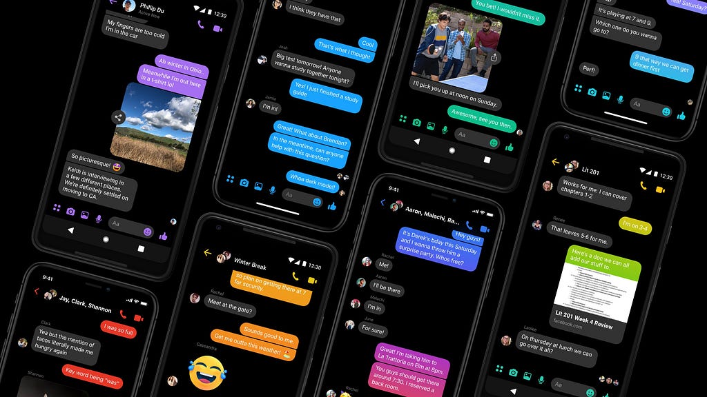
But dark mode demand was introduced before Google and Apple embraced it. Companies like Twitter, Facebook Messenger, Slack, Reddit, Viber, and others have previously adopted it, and Instagram is following.
The dark mode is becoming all-encompassing, on the web and on our smartphones on which the average user is spending ever more time. Dark mode is becoming a norm, and the modern app developer needs to adjust.
We had dark mode before and advanced to the black on white, paper-like style. Kind of. Originally, computers used monochrome CRT displays (Cathode Ray Tube).
And phosphor, used for lighting the display, was dark in color until hit by an accelerated electron, emitting a green glow (depending on the phosphor type used) on a usually black background.
RGB displays followed a similar route, but setting all the beams to “on” instead to form white color. After teletext’s arrival, a color palette was needed to represent this new medium.
Research shows that light colors like cyan or yellow on black were typically found to be optimal from a palette of black, red, green, yellow, blue, magenta, cyan, and white. Opposite to that is the dark-on-light color scheme, introduced in WYSIWYG (What You See Is What You Get), word processors, to simulate ink on paper.
Even then debates sparked whether text was more readable on a dark or light background. In the meantime, studies have been conducted stating that light text on a dark background is harder and slower to read, though marginally and not sufficiently enough to matter unless we’re talking about large amounts of text.
Some people suffer from conditions such as photophobia, a symptom of abnormal intolerance to light. They can experience discomfort, pain, and even migraines when reading dark on white for longer periods of time. Dark mode can be helpful for them. Then there is the blue light emitted from all displays.
You know, the blue light that had large media coverage due to numerous studies covering the matter. And for a good reason, since the on-screen time average is 3 hours and 15 minutes, with the top 20% smartphone users over 4.5 hours. I’d rather not disclose my average, it’s bad.

Blue light or the blue wavelength spectrum may be beneficial in the daytime since it can boost our attention, hence the increased usage in car dashboards. But it can also have negative effects on our sleeping rhythm.
Dark mode decreases blue light exposure, in varying degrees depending on the screen technology. In the case of OLED technology, black color emits no light, and can therefore, decrease battery consumption. OLED technology is not yet widely adopted by the industry but phone makers are including it in more devices, possibly future-proofing some of dark mode’s benefits.
OLED tech is also known for providing much higher contrast ratios than LCDs which are widely used. But a higher contrast doesn’t need to be hardware-based. As already made clear by Teletext’s arrival, a dark background makes content stand out.
Increasingly wider use of OLED technology will probably lead to further adoption of dark themes.
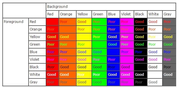
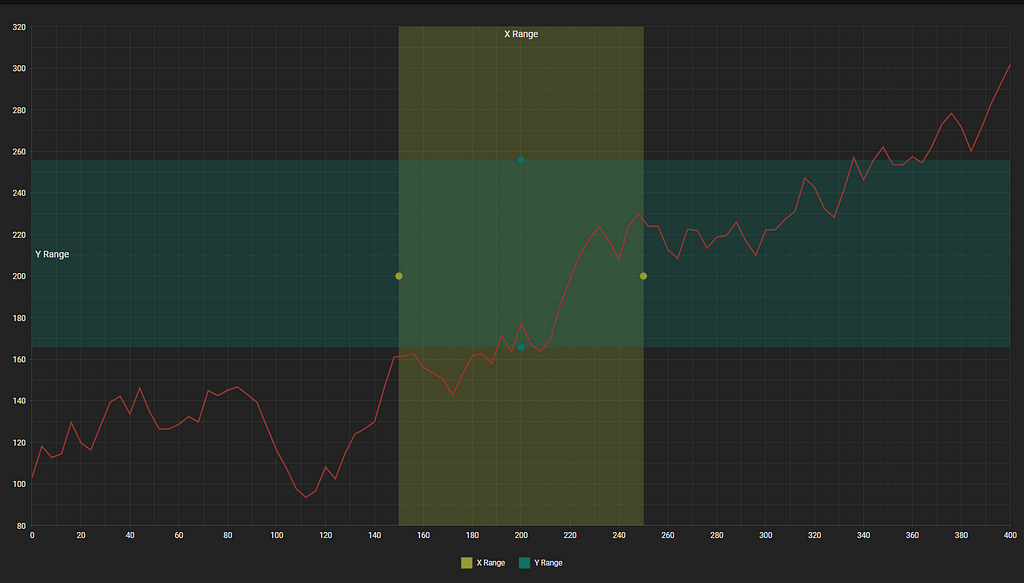
When most products go for a bland institutional white look, going dark can go leaps and bounds for your content to appear different. The extra pop achieved by the darker background is particularly useful when displaying graphical content like pictures or dashboards with chart data.
The picture above demonstrates how a dark background can make other colors universally stand out.
Any conscientious developer should indulge his users and create a dark mode for his apps and websites if he hasn’t already. That means you too. If you haven’t already created a dark theme for your apps and websites, you might reconsider to reap its benefits.
If it’s a webpage you are looking to “darkify” here is an appropriately named “cheap-ass” solution I found on Hacker News: Open the developer tools and apply the following style filter: invert(95%) hue-rotate(190deg) to the element.
There you go, you have yourself a dark mode. A cheap-ass dark mode. Isn’t it lovely? Don’t answer that. Moving on.
But what about adapting apps for mobile dark mode. Fret not, I’ve got you covered. Let’s start with iOS. Firstly, the app must be built and released using Xcode 11 and running on iOS 13.0 or later. Your app will support dark mode automatically and switch appearance automatically, hey it’s free work done! However, it can look weird in some cases since it’s automatic.
Apple implemented this really new neat trick called trait collection. About, like 5 years ago. It provides information like device type, screen size class, etc., but now, it gets a new property — userInterfaceStyle, to determine the view’s appearance style.
enum UIUserInterfaceStyle: Int { case unspecified case light case dark }
That allows you to override system appearance:
// Always light. let lightView = UIView() lightView.overrideUserInterfaceStyle = .light
You should go through your in-app images to make sure they look good in both view modes. Apple also introduced SF symbols, 1500 of them for use in app development which automatically adjust to the system’s appearance.
And as for Android, it had a dark mode in its previous OS, just not at this level. Now it supports system-controlled theming like iOS by setting the app’s theme to inherit from the system:
<style name="AppTheme" parent="Theme.AppCompat.DayNight">
It is better to avoid hard-coded colors and icons, instead opt for themed ones, e.g. use android:attr/colorBackground for the background.
There are many optimizations and tips on getting dark mode just right in your app, in the end, it is worth it and your users will be grateful.
Larger well-known sites and apps have used dark mode for great gain and brought a seemingly new user experience and improved overall usability. Youtube’s implementation felt like a breath of fresh air when it arrived.
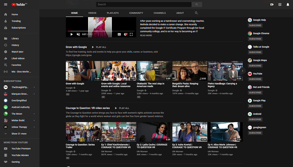
Its combination of dark gray colors with material design doesn’t strain the eyes with too much contrast yet makes both text and icons pop.
Media being its main content, dark mode cuts away unnecessary distractions and creates a fitting cinematic look, allowing you to focus purely on the content.
Visual Studio Code, a developer’s environment, has had a dark theme for years now. The same rule applies here as well.
In heaps of code, coloring different elements is key for differentiating code and navigating it. The default theme is a dark one, but it does give you the option to select a theme by clicking control+shift+p.
Everyone in my office is of the opinion that the dark themes are better because darker colors on a lighter background aren’t visually distinctive enough. And lighter colors on a light background like the solarized light theme look like a Starbucks pumpkin spice frappuccino with extra cream had spilled over the screen.
In cases like this, contrast and a dark background are almost mandatory, because it is much less strenuous to code in such an environment.
Today’s competitive market demands constant refresh and update, dark mode provides that. But adapting a complex site or app can be no easy feat.
I will share a few of our projects my colleagues at Codaxy, and I worked on recently. We included dark themes in all of them but it was actually a must have requirement for a project called Assetmax.

Assetmax, an asset management application, supports a dark mode theme among several others, but incorporeated it without restructuring the site since it uses the CxJS framework.

It benefited greatly from dark mode since it is suited for professional data display, where every bit of information is relevant. There’s a reason traders at Wall street also use light-on-dark color schemes.
Bright colors might be good when drawing attention to something but results in a counter-effect when a lot of (especially important) information is displayed. It can sometimes make a mess. Dark color brings attention to only the necessary elements on a page, and information is easier to pick out.
CxJS is a React-based framework developed by Codaxy. It was intended for building advanced user interfaces and large enterprise apps for the finance sector, transportation, cloud management, you name it.

Focus on solving the puzzle, instead of searching for the pieces.
But developing an advanced user interface for such projects, would usually require combining components from several other sources. CxJS rectifies that and merges everything into one package, simplifying development, project complexity and saving time.
It uses declarative data-binding and JSX allowing you to use HTML and XML like structures. You can read further about it in the official CxJS documentation..
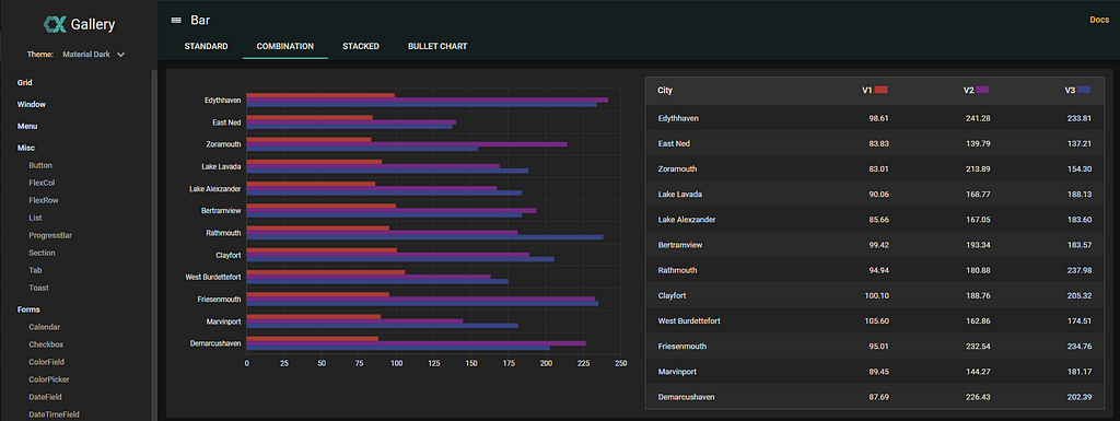
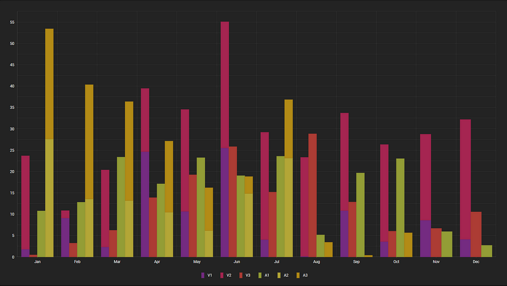
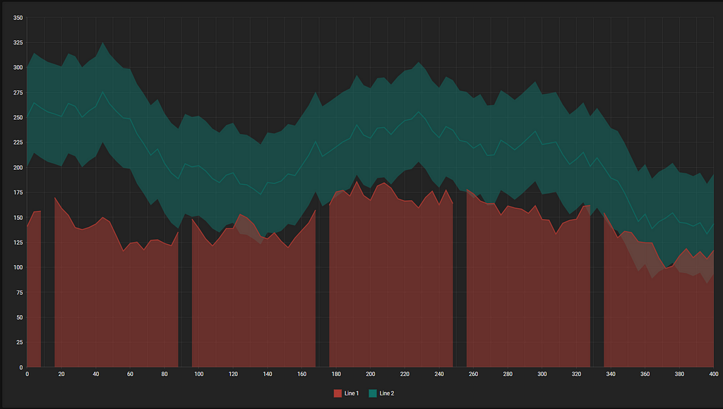
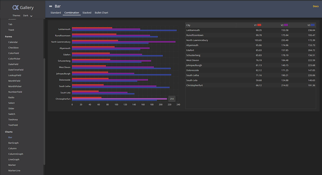
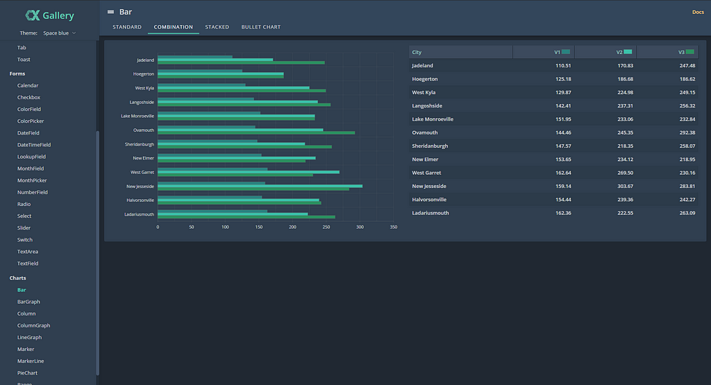
CxJS currently offers three dark themes that you can check in Cx Gallery. Cx Gallery is another prime example of dark mode and theme application. Its purpose is to display potential Cx widget implementation and their theming. Feel free to browse the site and check out all the different widget types, functions and prebuilt themes.
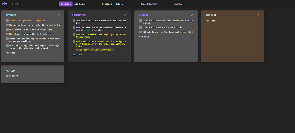
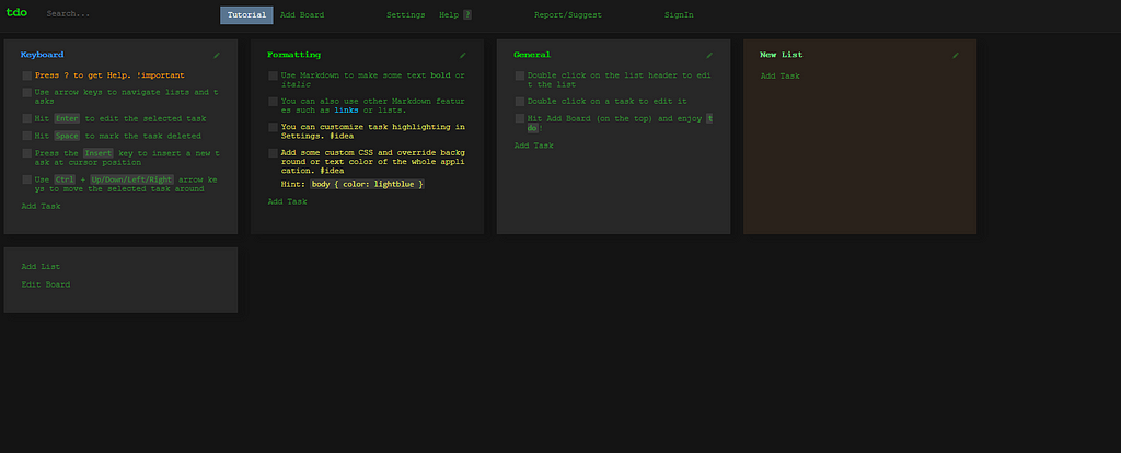
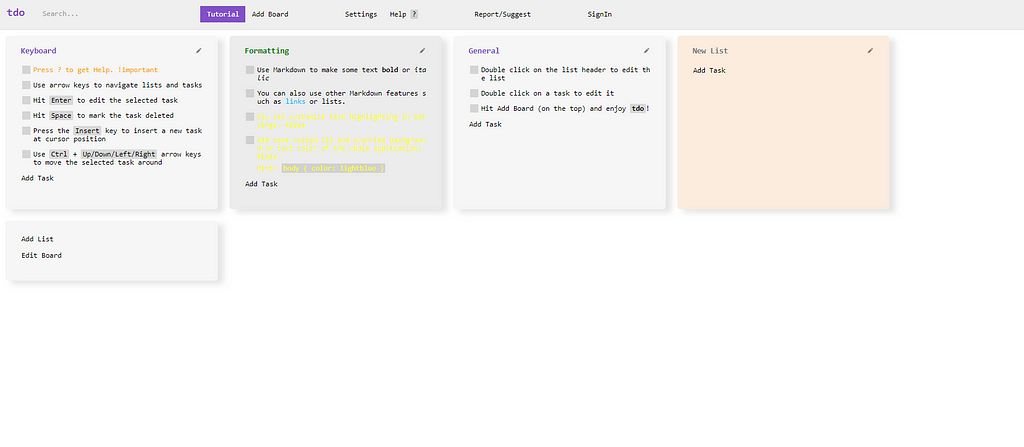
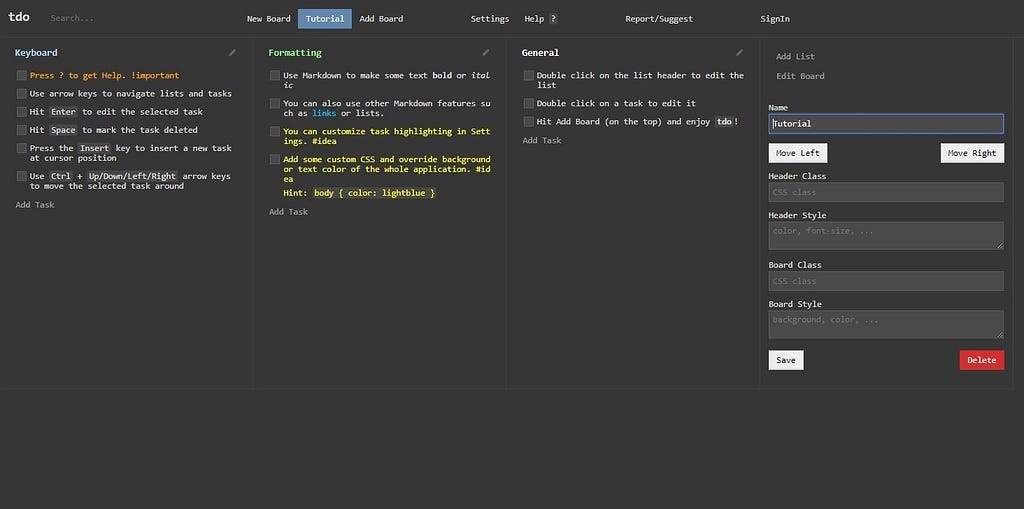
Tdo is an app written with CxJS and is visually similar to Visual Studio Code. Since it is a utilitarian one it follows the same guidelines, concentrating on its content. That means a dark background and distinctive text.
Its purpose is that of a to-do list and for note-taking, but with a few twists and turns. Like, being completely operable on a keyboard, or supporting CSS and Markdown for visualizing and editing text and headers.
Dark mode might be here to stay or it might be just a fad, we’ll need to wait and see how that unfolds. Its benefits certainly outweigh the drawbacks, and its characteristics coincide with the current trend in technology, e.g. OLED displays.
Anyway i highly recommend you look more into the matter yourself, and try to find your own conclusions. Let me know about your opinions down in the comments.