You’ve been tasked by your boss to talk to a client about urbanisation issues in Asia. The trouble is you don’t know how to make boring World Bank’s data look attractive.
You must ensure:
The best thing you can do is turn dull figures into visually pleasing images. The emphasis is on “visually pleasing”. When data is visualized in a non-intuitive way, you may cause additional confusion despite the brain’s impressive processing powers.
Here’s a piece of trivia. The MIT researchers recently discovered that the human brain can process images that the eye sees in only 13 milliseconds. In other words, our brain tries to find concepts and extract meaning between them to help us function normally in a fraction of a single second.
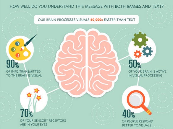
We live in the age of visually demanding digital natives. To be able to communicate with them we must sharpen our visual literacy writing and reading skills. The whole purpose of effective data visualization is to create images your viewers understand right off the bat.
The main role of data visualization is to ‘translate’ seemingly meaningless bunch of abstract data into understandable images. Your main challenge is to generate images that allow your client to intuitively grasp complex relationships in seconds.
If you present pleasing images to your client, all you have to do is use words to explain images further so s/he can connect the two sources of information with her/his prior knowledge.
Let me explain what I mean. Imagine you’re interested in total unemployment rate in Europe (% of total labour force) modelled based on International Labour Organisation’s estimates. You want to focus on 2014.
When you land on the World Bank’s site you’ll see a table that looks like this.
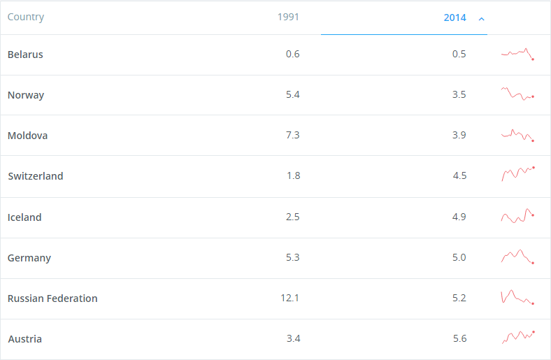
You’re interested in making sense of 2014 data. The trouble is, you’ll have to scroll down to get all the percentages you need. But this is a tedious task. Why not turn these boring data into visually attractive image such as the one below.
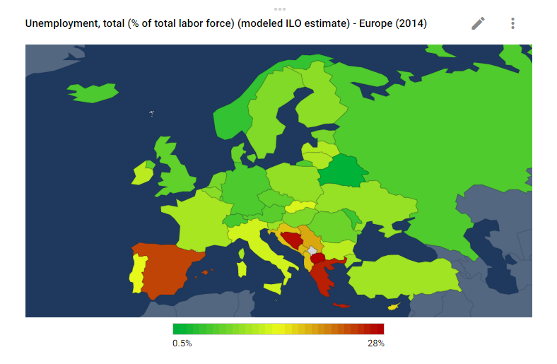
Now, this is way easier to interpret: the greener the country, the fewer unemployed workers there are.
The red colour mainly in the Europe’s south indicates higher unemployment. The above table view looks complex and boosts frustration, while the second image paints the picture of Europe’s unemployment in a flash.
The World Bank’s data is immensely useful to businesses and all sorts of organizations. It’s freely available and in most cases users can make sense of the data thanks to data visualization.
The rest of this post I dedicate to comparing two handy online tools that crunch boring World Bank’s data into visually appealing images.
The first one is https://www.gapminder.org/, tool developed by the late professor Hans Rosling who established the Gapminder Foundation (TGF). TGF offers software that allows users to show animated statistics from your computer.
Probably the most useful aspect of this tool is that you can show stats without internet access. Second, Gapminder’s database is updated automatically when new data becomes available.
Gapminder requires you to install Adobe Flash Player if you don’t have it already. They use very intuitive images to communicate complex messages such as this one.
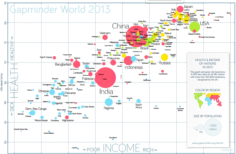
Gapminder is a truly superb online and offline application. The main ‘problem’ with Gapminder could be it’s complexity. I feel that an average user may find it a bit too difficult to handle.
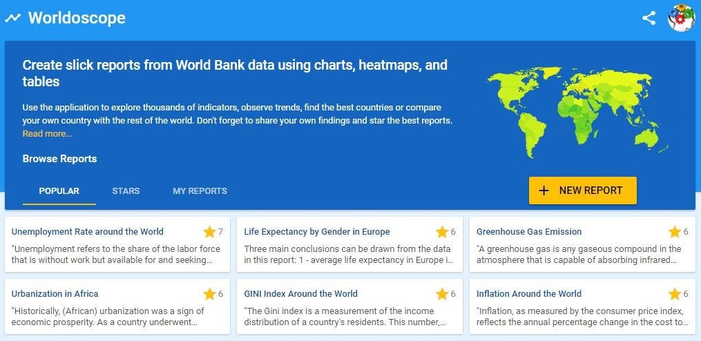
Worldoscope, on the other hand, is also a freely available online tool. I find Worldoscope very convenient so let me run you through some basic steps.
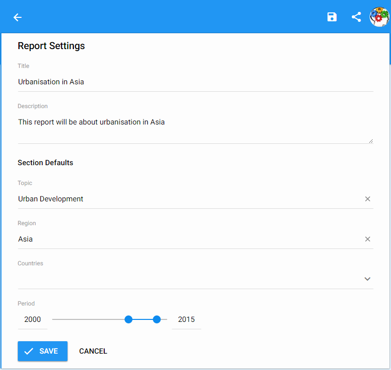
First, I suggest you create your own account. Then you click on “new report”.
This action will take you to the following window. Here you’ll name your report, provide a short description, under “Topic” you’ll select ‘Urban Development’ (or any other topic you desire from the World Bank’s data), in this exercise I picked Asian region, and a year you look into. Finally, you click ‘Save’ to create your first page report.
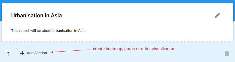
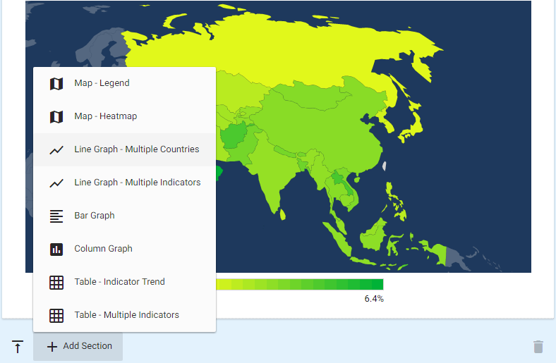
Now we go into details. After you save the report, click “Add Section”.
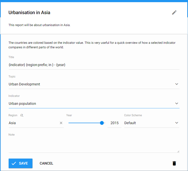
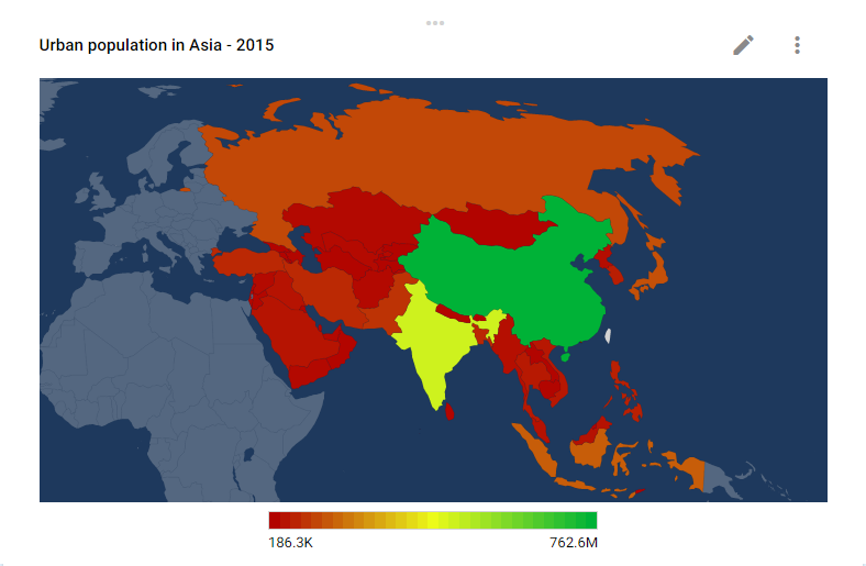
That will take you to the following window. Let’s imagine we want to start with a general overview about total urban population in Asia as an introduction to urbanisation on the continent.
Once we save this report we get the following map that really gives us an overview of the entire continent. But that’s not what we’re really into. We want to see the ratio of urban population in the total population.
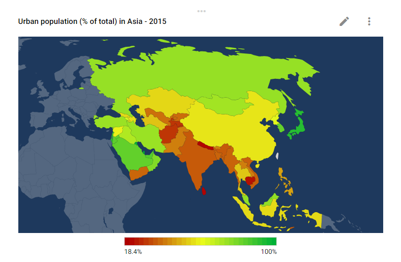
Again, click “Add Section”, pick Urban population (% of total) and you’ll get the next image. As you can see, this story is getting more interesting. Now we find that the vast majority of urban population lives in Japan, Saudi Arabia or Russia, while countries neighbouring India have the highest share or rural population.
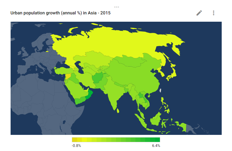
But you want to impress your client further. Let’s explore the annual growth of urban population. You may be surprised to notice that the urban population in the entire Asia — save for Russia and Japan that are already mainly urbanized — is rapidly growing.
I won’t go into further details here, because there’s no end to it. It’s worth knowing though, that Worldoscope offers a whole set of tools you can use to impress your audience.
I used to illustrate this example, but you can choose between line graphs, bar graphs and tables. Sometimes you’ll need comparisons between different countries or different indicators. In such cases you’ll be better off using line graphs.
You can see the illustration report here.
The major downside of Worldoscope is the lacking data on the World Bank’s site. When you try to compare some indicators it won’t get you anywhere. It’s simply because the data is missing, but the actual tool is fully functional.
The whole point of data visualization is to translate “rocket science” into easy-to-understand language. In this post I tried to compare the two interesting online tools. I find both of them extremely powerful and useful.
The main advantage of Gapminder is the number of functions and extremely appealing animated statistics. With Gapminder’s desktop version you can work offline and draw all available statistical sets to use in your presentations. I find it very powerful when comparing between countries or regions.
Worldoscope on the other hand is also freely available online tool. It’s based on a different algorithm and its visuals are different to Gapminder’s. I feel this tool is tremendously useful for PowerPoint presentations when you want to focus the attention of your audience on a specific indicator presented through geographical prism.
Whether you’re into simple data analyses or high-dimensional data analyses, you should consider using visual elements. I would advise using both of the tools presented in this post, though for different purposes.