In the last couple of weeks, we worked hard on new themes for Cx and this post will provide answers to some of the questions we faced so far.
Initially, we wanted Cx package to ship only widgets. The host application would have to provide global CSS rules for reset, typography, layout, helpers, etc. This is provided by Bootstrap and other CSS frameworks.
Each theme is presented using a separate application. We didn’t want to use an external framework, and we decided to put additional stuff in Cx. Cx now includes extra CSS rules which can be used to reset default CSS values across browsers, set-up typography and define other global rules.
Besides that, Cx also contains Section and FlexBox widgets which can be used to create basic layouts. This is a minimal set of changes required to build simple applications such as theme previews.
This is, of course, optional and you may use your favorite CSS framework for these things — for example, tachyons seems interesting.
Now we can answer the question. A theme is a set of styles that define the appearance of Cx widgets with an optional set of global CSS rules used to unify default values across browsers, define typography and set other defaults.
Cx themes are based on Sass. Sass is a language that provides advanced CSS authoring mechanisms such as variables and mixins. Variables contain measures, colors and other reusable values used to define a certain visual aspect of a theme.
Variables are passed to mixins to produce actual CSS. Each Cx component has Sass mixin and an optional set of variables. Component mixins may be invoked multiple times with different values to generate a different appearance of the same component.
Cx sets all variables to default values, what is known as Core theme. Other themes redefine values of the variables and use the same mixins to generate CSS. Only variables need to be changed to create new themes or tweak existing ones.
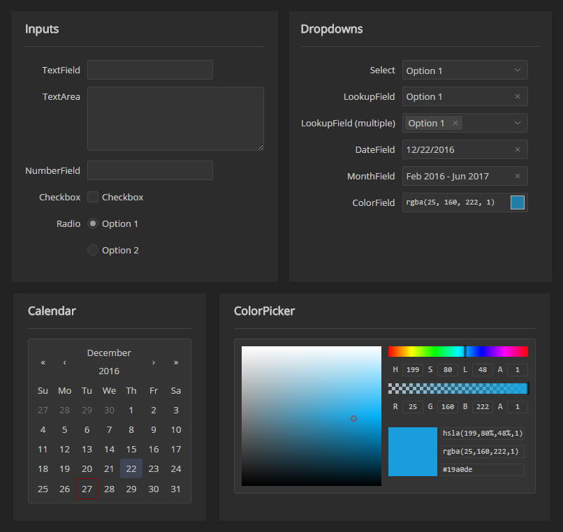
There’s now a new page dedicated to themes where you can explore themes in depth. Besides the default appearance of Cx widgets (Core theme), there are two new themes: Dark and Frost.
Dark themes are commonly used for development tools and financial applications.
Most programming environments provide a dark theme as it eases the strain on the eyes after an extended period of use. For example, Visual Studio, Webstorm, and Atom feature such themes.
Cx Dark theme is inspired by See Carbon theme for Ext JS, and it was first implemented in tdo, our task management demo application.
In this time of year, winter is a direct inspiration. Frost theme uses light colors and round borders to transfer the winter feel into your application.
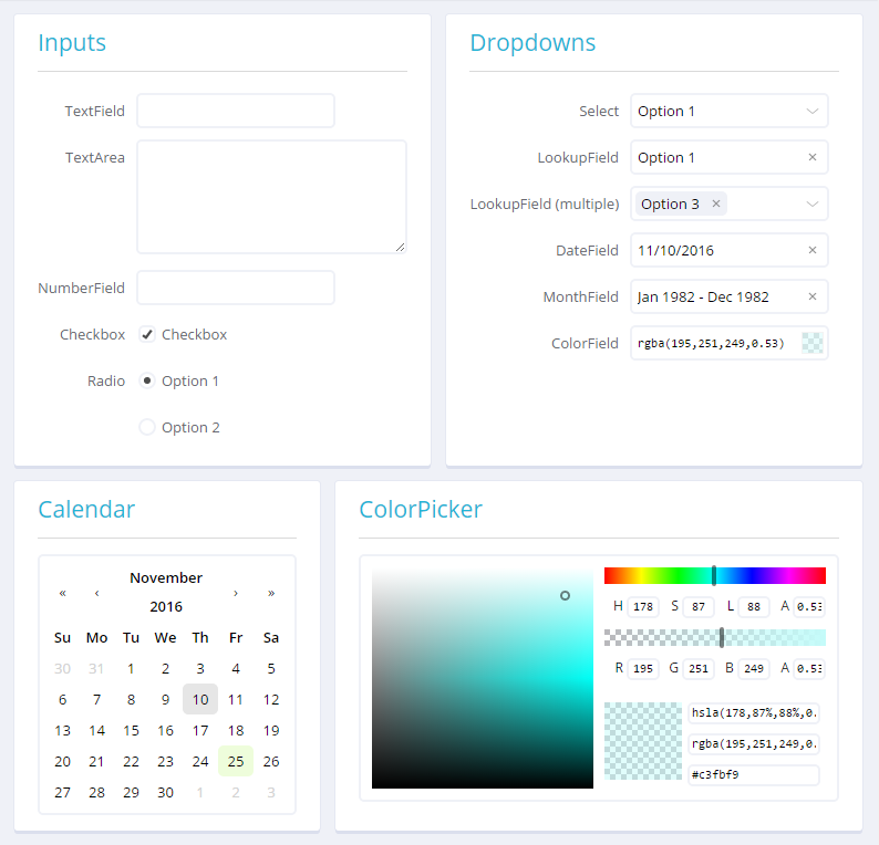
Frost theme is inspired by our Starter Kit project.
Themes are available as NPM packages.
To install a theme in your Cx application, first install the theme package using npm or yarn and then redirect Sass imports to the newly installed theme.
npm install cx-theme-dark -S
Change the theme by replacing
@import "~cx-core/src/variables";
...
@import "~cx-core/src/index";
with
@import "~cx-theme-dark/src/variables";
...
@import "~cx-theme-dark/src/index";
That’s it. Your application should now look different.
One of the questions that popped up was how to handle icons. Each application uses a different set of icons which appear in widgets such as buttons or input fields. After reading Creating an SVG Icon System with React on CSS-Tricks, it became apparent that this is a perfect approach for Cx.
We decided to create an extension point where each application can define how to render its icons and Cx uses that to put icons inside Cx widgets. This approach makes it easy to integrate icons coming from icon fonts like FontAwesome, to use png or SVG. An icon is just a React component.
For example, to implement FontAwesome icons in your application, use the following snippet:
import { VDOM } from 'cx/ui';
import { Icon } from 'cx/widgets';
Icon.registerFactory((name, props) => {
props = { ...props };
props.className =fa fa-${name} ${props.className || ''};
return <i {...props} />
});
You can now use icons as simple as this:
<Button icon="search">Search</Search>
Although Cx is now feature-complete, we want to add more muscle, like a couple of new themes and some nice to have widgets. Stay tuned.